CSS Transforms
With CSS3 came new ways to position and alter elements. Now general layout techniques can be revisited with alternative ways to size, position, and change elements. All of these new techniques are made possible by the transform property.
The syntax for transform :
div {
  -webkit-transform: scale(1.5);
     -moz-transform: scale(1.5);
       -o-transform: scale(1.5);
          transform: scale(1.5);
}

2D Transforms:
Elements may be distorted, or transformed, on both a two-dimensional plane or a three-dimensional plane. Two-dimensional transforms work on the x and y axes, known as horizontal and vertical axes. Three-dimensional transforms work on both the x and y axes, as well as the z axis. These three-dimensional transforms help define not only the length and width of an element, but also the depth. We’ll start by discussing how to transform elements on a two-dimensional plane, and then work our way into three-dimensional transforms.
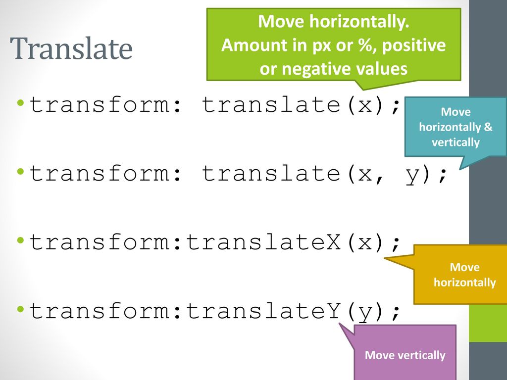
2D Translate:
The translate value works a bit like that of relative positioning, pushing and pulling an element in different directions without interrupting the normal flow of the document. Using the translateX value will change the position of an element on the horizontal axis while using the translateY value will change the position of an element on the vertical axis.
.box-1 {
  transform: translateX(-10px);
}
.box-2 {
  transform: translateY(25%);
}
.box-3 {
  transform: translate(-10px, 25%);
}
Perspective:
The perspective of an element can be set in two different ways. One way includes using the perspective value within the transform property on individual elements, while the other includes using the perspective property on the parent element residing over child elements being transformed.
The example below shows a handful of elements all transformed using their individual perspectives with the perspective value:
.box {
  transform: perspective(200px) rotateX(45deg);
}
3D Transforms
Working with two-dimensional transforms we are able to alter elements on the horizontal and vertical axes, however there is another axis along which we can transform elements. Using three-dimensional transforms we can change elements on the z axis, giving us control of depth as well as length and width.
3D Rotate
Using the rotateX value allows you to rotate an element around the x axis, as if it were being bent in half horizontally. Using the rotateY value allows you to rotate an element around the y axis, as if it were being bent in half vertically. Lastly, using the rotateZ value allows an element to be rotated around the z axis.
the syntax for 3D Rotation :
.box-1 {
  transform: perspective(200px) rotateX(45deg);
}
.box-2 {
  transform: perspective(200px) rotateY(45deg);
}
.box-3 {
  transform: perspective(200px) rotateZ(45deg);
}
Transform Style
The transform-style property needs to be placed on the parent element, above any nested transforms. The preserve-3d value allows the transformed children elements to appear in their own three-dimensional plane while the flat value forces the transformed children elements to lie flat on the two-dimensional plane.
.rotate {
  transform: perspective(200px) rotateY(45deg);
}
.three-d {
  transform-style: preserve-3d;
}
.box {
  transform: rotateX(15deg) translateZ(20px);
  transform-origin: 0 0;
}
Transitions & Animations in CSS
With CSS3 transitions you have the potential to alter the appearance and behavior of an element whenever a state change occurs, such as when it is hovered over, focused on, active, or targeted.
Animations within CSS3 allow the appearance and behavior of an element to be altered in multiple keyframes. Transitions provide a change from one state to another, while animations can set multiple points of transition upon different keyframes.
Transitional Property
The transition-property property determines exactly what properties will be altered in conjunction with the other transitional properties. By default, all of the properties within an element’s different states will be altered upon change. However, only the properties identified within the transition-property value will be affected by any transitions.
.box {
    background: #2db34a;
    border-radius: 6px
    transition-property: background, border-radius;
    transition-duration: 1s;
    transition-timing-function: linear;
  }
  .box:hover {
    background: #ff7b29;
    border-radius: 50%;
  }
Animations:
Transitions do a great job of building out visual interactions from one state to another, and are perfect for these kinds of single state changes. However, when more control is required, transitions need to have multiple states. In return, this is where animations pick up where transitions leave off.
@keyframes slide {
  0% {
    left: 0;
    top: 0;
  }
  50% {
    left: 244px;
    top: 100px;
  }
  100% {
    left: 488px;
    top: 0;
  }
}
Customizing Animations
Animations also provide the ability to further customize an element’s behavior, including the ability to declare the number of times an animation runs, as well as the direction in which an animation completes.
Here’s 8 SIMPLE CSS3 TRANSITIONS THAT WILL WOW YOUR USERS:
-
- Fade in
- color change
- Grow & Shrink
- Rotate elements
- Square to circle
- 3D shadow
- Swing
- Inset border
What Google Learned From Its Quest to Build the Perfect Team?
Psychological safety: Everyone feels safe in taking risks around their team members, and that they won’t be embarrassed or punished for doing so. Dependability: Everyone completes quality work on time. Structure and clarity: Everyone knows what their specific expectations are.
The key characteristics of ‘enhanced teams’
After years of analyzing data and interviews from more than 180 teams across the company, Google found that the kinds of people (a.k.a. the individual personalities) in a team are not so relevant.
“We had lots of data, but there was nothing showing that a mix of specific personality types or skills or backgrounds made any difference. The ‘who’ part of the equation didn’t seem to matter,” Dubey said in an interview with The New York Times.
Instead, the researchers found that there were five key characteristics of enhanced teams:
1.Psychological safety 2.Dependability 3.Structure and clarity 4.Meaning 5.Impact
Left brained vs. right brained personalities
A simple way to look at this is through the “left brain vs. right brain” theory, which goes that everyone has a dominant side of the brain (the right or the left), and it determines their personality, thoughts and behavior.
Right brained people are said to be more intuitive, creative, free-thinking and have the ability to collaborate and connect. They are the relationship-builders, and they are vital to a team’s success.
Left brained people, by contrast, are more logical, analytical and objective. Unlike right brained people, who tend to think in visuals, left brains are detail- and fact-oriented, and they prefer to think in words and numbers. They are more pragmatic. While left brain skills and traits may distinguish individual contributors, they are only table stakes (literally, as they can mostly earn you a seat at a team’s table).
